
You must log in or register to comment.
Nothing more beautiful than seeing transparent yellow-orange overlaid on top of transparent orange-yellow
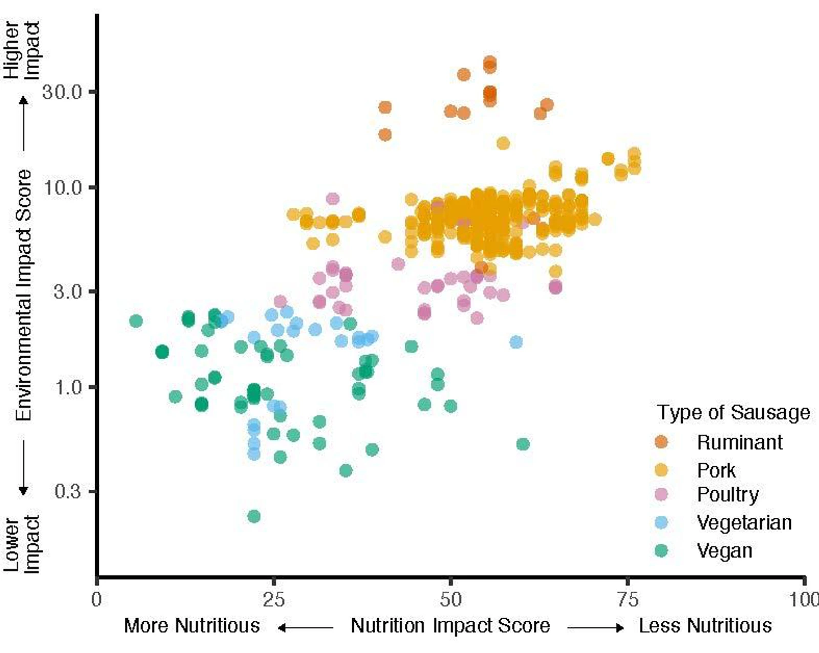
X = 100 → zero nutritious?
Why inverted?
Hope this helps:)
(The chart legend seems not to be placed properly, maybe that’s why they mirrored the chart.)
Oi, I noticed the vertical axis is logarithmic, the impact difference is bigger than I thought.
Thanks :)
I feel that a lot of posts lately have been very “ugly” in terms of data representation. Dunno what that’s about, or if it’s just me.
People upvote because they like the content of the data or how it supports their agenda, while forgetting that this community is supposed to be about judging the representation of it specifically. And that’s assuming they’re even paying attention to the community name in the first place, which many may not be.
It’s been a perennial issue both here and in r/dataisbeautiful as long as I can remember.
Try finding a genuinely oniony story on /r/nottheonion and not just a funny news article
Well, isn’t that how it’s also done on the reddit sub by the same name for years?
Really important to notice that the environmental impact is logarithmic here. Switching to plant based products, even for one or two days a week, has an immense positive impact.
Yes! Switching to vegan doesn’t have to be a binary, black or white, all or nothing, thing. The best way to go vegan, imo, is gradually. Start by trying different vegan foods until you find stuff you like and crave. Learn to cook tasty vegan stuff then slowly eat more and more vegan stuff you like.
One of my favorite vegan meals is freshly baked sourdough dipped in olive oil and bsalmic vinegar.
This is how I ended up having impossible burgers with bacon and cheese
Measuring nutritional value on a single good/bad axis will always give a very misleading picture, especially if you don’t specify how it’s measured. You can choose reasonable metrics to make that axis look however you want.
For anyone interested, they used Nutri-Score for this plot.
Nutri score just looks at the kCal and fat/carb/prot distribution.
So it really isn’t about the quality of the food, but just about how “balanced” it is.
Ruminant?
Who the hell is eating goat sausages?
beef…


