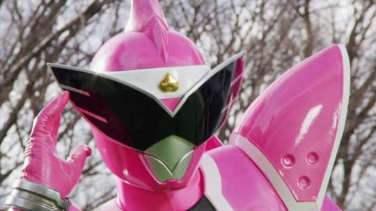

all these promo images are amazing. Geats has to be one of the most visually consistent rider series in years.
Can u elaborate on that last part?
Oh sure! I like when all the suits feel like they are visually similar. especially if there are more than 2 riders. like W and OOO can get away with the riders looking vastly different cause there is only two of them. but when there are a lot of riders, i prefer there to be a visual through line between all their designs. some more recent rider seasons felt to me like the suits came from very different places, even different shows sometimes. while in Geats the players all have the same base with the power ups adding on top of it. the design language is present in all of them. some other visually consistent seasons in my opinion, Kabuto, Gaim, and Ex-Aid.
TLDR there are some details in the suits that make them feel visually connected in my head, and not just a bunch or randos.
imo most rider seasons with more than a few riders have visually consistent costumes. I made this Reddit post a year ago on this very topic. I still think Revice is the only season where costumes varied more than just a little.
See here is the thing. Revice all over the place, but the other past reiwa seasons I have looked at the suits in just solo promo photos. And when they aren’t all together they feel more visually different than they are. Now I wonder how build matches up cause that’s felt like it was too disparate, but most likely has more cohesion than I thought.