
- cross-posted to:
- [email protected]
- cross-posted to:
- [email protected]
You must log in or register to comment.
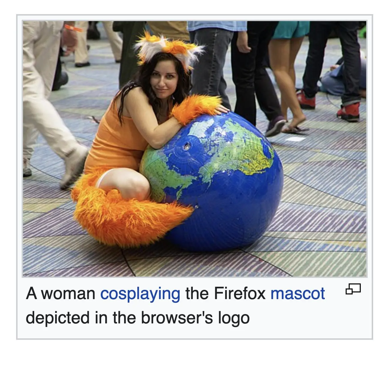
+2 points for the paw and the continents.
The globe was probably bought not made. But still pretty neat overall
Yep, it’s clearly a vinyl blow-up ball.
What’s this?
┴┬┴┤( ͡° ͜ʖ├┬┴┬
┬┴┤ \(°ロ\)
Shoo, get back in there
Oh! Were you waving to me?
/╲/\╭( ͡°͡° ͜ʖ ͡°͡°)╮/\╱\
Hewwo fwen! UwU
Ohgodohfuckhgcdr
(((( ;゚Д゚)))
ლ(ಠ益ಠლ)
“Wants to dress as a furry, but doesn’t want the stigma as a furry”
Nice cosplay. You gotta admit that the Firefox logo is better than all the other browser logos out there. It’s pretty lit.
the old ones, yes
I respect the current one. I do prefer the old one, but the current one is still regonizable as a fox around a
globe representing the word wide webball.I think from 2013 is my favorite. I’d probably like the fox from 04 and the globe from 13 the best.
17 and 19 are both cool logos on their own, but are literally duller then the others. They got rid of all the pointy bits. The fire gradients on both are nicely done.
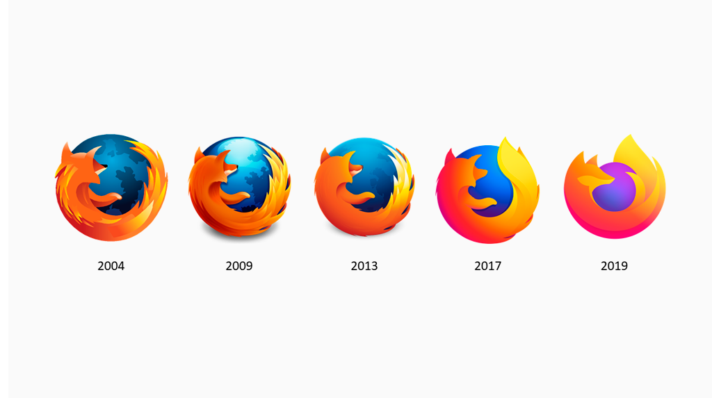
Going from left to right it looks like he spent nine years drinking the world’s oceans and has since moved on to consuming the planet itself.
I honestly like 2004 the best. I could see the issue with it then when resolutions were lower, but I feel like we could go back to it now. It looks so much nicer, though arguably less recognizable at a glance from across the room or something.
Is it though? Regardless of the amount of detail you still see the big orange swirl around the blue ball from across the room.
2013 has the perfect balance between details and simplicity. It was too detailed before and has become too dull after.
The 2017 one is a bit bland but at least it kept the shape and colours from before. I hate the 2019 one because all that has changed.
Its a metaphor for what’s happened to the internet.
🥰
Approved.
I can fix her

They started going with a minimalist style logo
But for one single day, firefox nightly looked like this
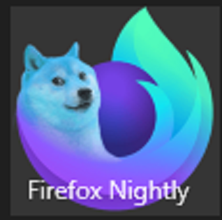
I took a screenshot because I was worried no one would believe me
I don’t even use regular firefox anymore, I use mullvad browser and librewolf whenever I’m not using Brave.
The fingerprinting protection in regular firefox sucks, and regular firefox makes connections to google, double-click and other advertising companies, they even make those connections when you open a new tab.
Librewolf, tor and mullvad browser are completely clean and free of bloat
Damn, I’ve never wanted to be the world so bad.
Yes but remember, thats just a human woman under there; you wouldnt actually be caressed by the perfect web browser.
Omg, woman showing skin! Updoot!
It’s a knee and an arm… What are you? Amish?
This loser spends his days trolling everywhere. He is an insecure jobless brat that nobody IRL gives a shit about, so he lives with negative attention online. This is the second time I am seeing him somewhere.

No, but they make my male lizard brain fire up. So I feel the need to provide engagement by updooting and leaving a silly comment.
I do love me a good satire account. Keep on keeping on


