I don’t like how it looks either. Way too busy. Only thing is, it is lightweight though. New reddit usually crawls to a halt after half an hour of scrolling (which is probably good for my mental health).
I agree it’s terrible on mobile, but it’s the wall of text I love on desktop. I want to see as many titles on a subreddit as I can.
The Lemmy web desktop UI is quite similar. I just wish the list of subscribed communities was more accessible rather than being at the bottom of the instance home page.

Very unpopular opinion:
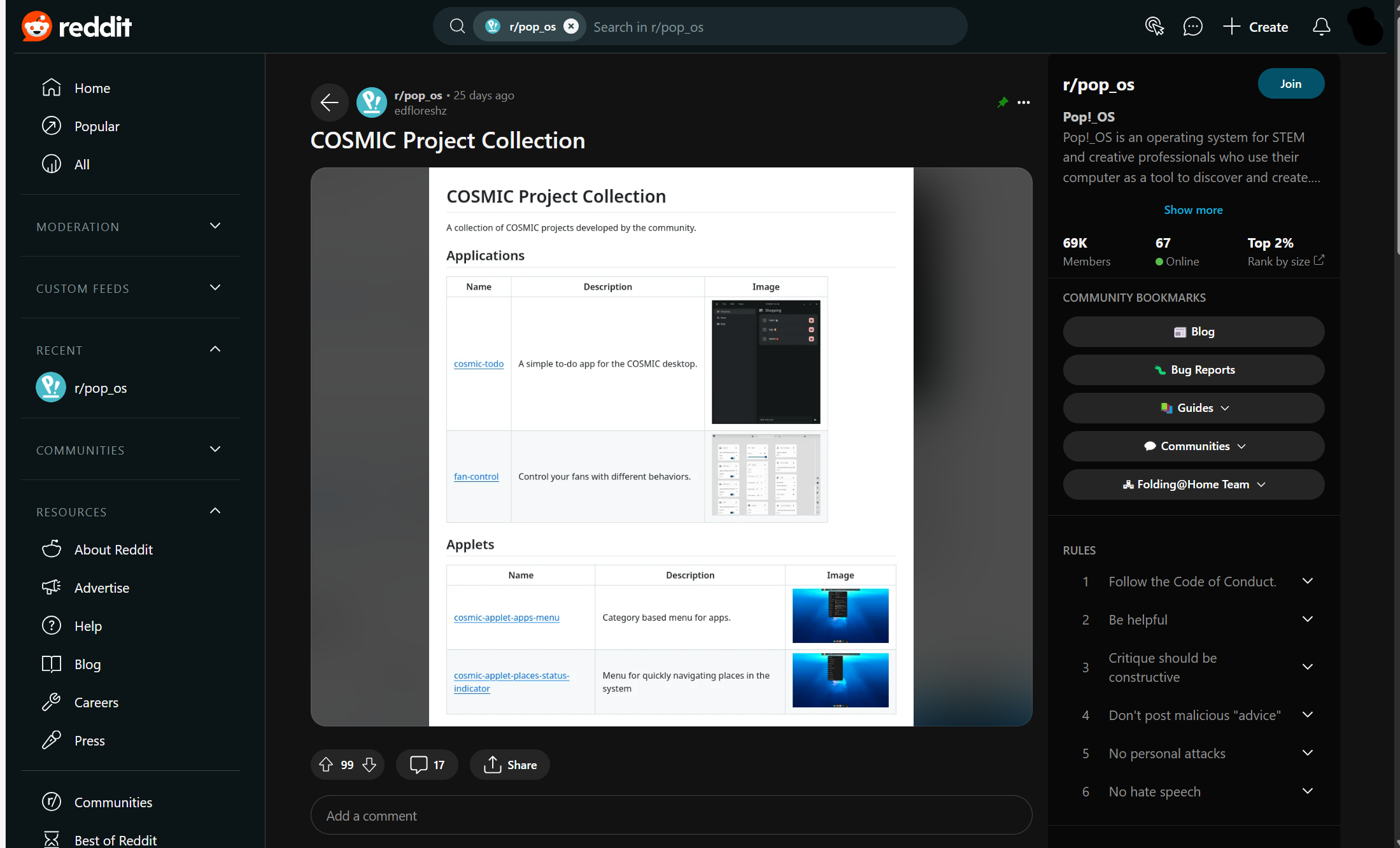
Old ui sucks. You can’t see shit on phone nor on desktop. It’s just wall of text.
Old reddit absolutely had its issues. The new and newnew design is just decisively worse however.
I don’t like how it looks either. Way too busy. Only thing is, it is lightweight though. New reddit usually crawls to a halt after half an hour of scrolling (which is probably good for my mental health).
I agree it’s terrible on mobile, but it’s the wall of text I love on desktop. I want to see as many titles on a subreddit as I can.
The Lemmy web desktop UI is quite similar. I just wish the list of subscribed communities was more accessible rather than being at the bottom of the instance home page.
The new layout blobby and spyware
How can a layout be spyware ?
JavaScript
For the mobile UI:
Old reddit: Yes
Around Reddit API debacle: Alright UI
Newest Reddit UI: Annoying