Though this is a great chart, it isn’t quite the whole picture either for climate impact. Almonds and almond milk get to be a lot worse alternative option if you consider the water consumption concerns where they are grown in California. They have many similar charts that attempt to quantify holistic carbon footprint.
Long story short, though not eating animal products is best for the environment, even just eating beef less often and not worrying about eggs and chickens can get you to over half the climate impact of full veganism and is a much easier transition for some.
as just one facet, they count everything fed to beef, including cottonseed, when calculating the inputs. but cotton isn’t grown for cottonseed. if we didn’t feed a large portion of our annual cottonseed to livestock, it would just be wasted. vegans will tell you that the return is only 1/10 of the input, but that’s a lot better than 0/10.

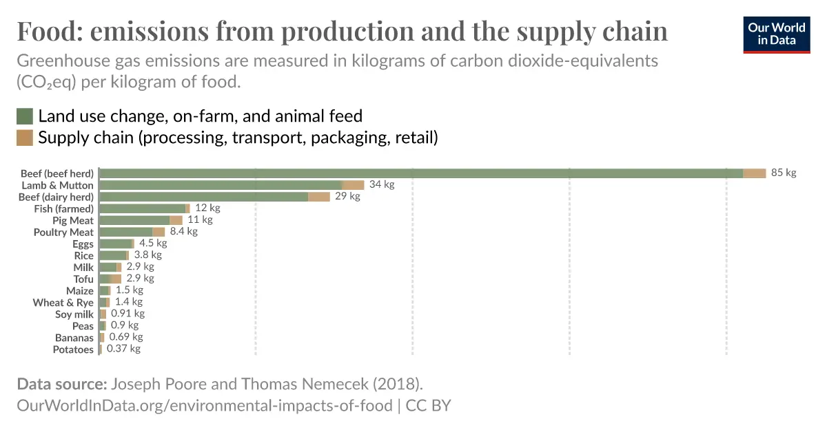
Another “fun” chart on various food sources green house gas emissions adjusted per kilogram of food product.
Source
I love how the chart breaks cows into multiple categories making it look that much smaller even though it’s still chart topping.
Edit: Oddly enough they’re citing the same data in both the one I link and OP’s link.
Though this is a great chart, it isn’t quite the whole picture either for climate impact. Almonds and almond milk get to be a lot worse alternative option if you consider the water consumption concerns where they are grown in California. They have many similar charts that attempt to quantify holistic carbon footprint.
Long story short, though not eating animal products is best for the environment, even just eating beef less often and not worrying about eggs and chickens can get you to over half the climate impact of full veganism and is a much easier transition for some.
poore nemecek had flawed methodology and should not be the basis of policy decisions.
Kindly explain where so we can make our own opinion.
as just one facet, they count everything fed to beef, including cottonseed, when calculating the inputs. but cotton isn’t grown for cottonseed. if we didn’t feed a large portion of our annual cottonseed to livestock, it would just be wasted. vegans will tell you that the return is only 1/10 of the input, but that’s a lot better than 0/10.