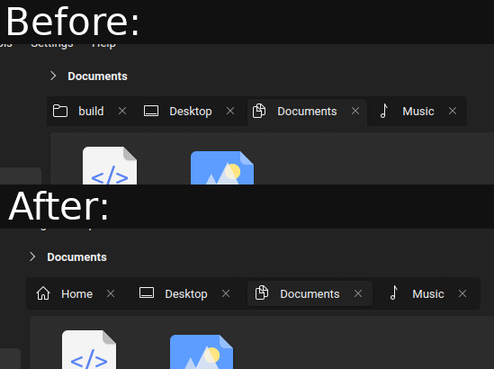
Consider having just two of them. The one which is active actually seems like a button that demands attention. It’s basic design stuff. Tabs denote choices between active viewports, it should be unambiguous always which one is active. These hovering tabs are more like buttons which intuitively ask to be clicked
Try looking at the comparison screenshots in this repo. Or look up some images of firefox australis. You’ll see how tabs are actually behaving like tabs and are denoting clearly which one is active by linking itself naturally to the viewport

in what way is this an accessability issue, it just seems to be a minor visual stylization change?
Consider having just two of them. The one which is active actually seems like a button that demands attention. It’s basic design stuff. Tabs denote choices between active viewports, it should be unambiguous always which one is active. These hovering tabs are more like buttons which intuitively ask to be clicked
https://github.com/black7375/Firefox-UI-Fix
Try looking at the comparison screenshots in this repo. Or look up some images of firefox australis. You’ll see how tabs are actually behaving like tabs and are denoting clearly which one is active by linking itself naturally to the viewport
Edit: https://github.com/Glitchcode2447/Firefox-Australis-Theme
it seems more like a radio button describing where you are and where you can go, which is just slightly more abstract than tabs.
Because it works like that, but in the traditional way, not all corners are rounded, and there’s no margin in the bottom.