Here are some proposed graphics.

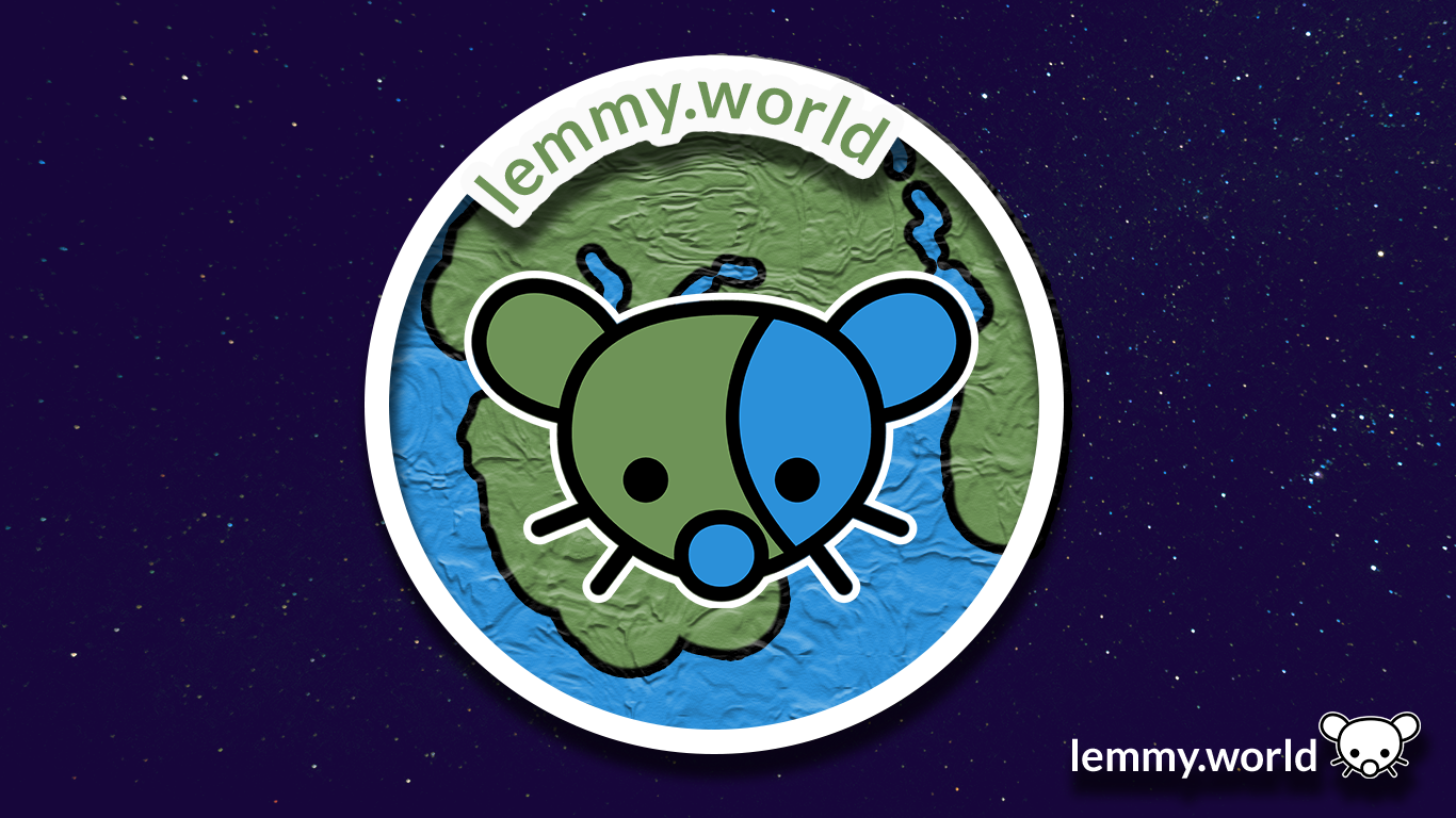



I’ve now made a repository on GitHub, so that you can download the graphics and use them for your communities and projects. There’s even an Etsy store selling stickers now.
idk why but it reminds me of Little Big Planet, especially the second one
anyway they all look pretty good, but if it will be displayed on the page next to the title, I think only fourth one will be visible clearly without getting close to the screen or opening image in a new tab
For the original effort on Mastodon, the Little Big Planet vibe was indeed an inspiration. The ‘hand made’ aesthetic is a really neat way to share that a place is being created and made by its users, and having it be a tangible, almost print or paper product, I felt it touched that key cultural element of both Lemmy and the work of the fediverse/activitypub.
Dont really like any of them. They are to busy for no real benefit. The logos are not unique enough that you would instantly recognize them. Because they are not better than the current generic earth picture I say we just leave it.

