
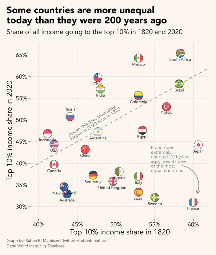
France was extremely unequal 200 years ago; now it’s one of the most equal countries
Source: https://twitter.com/xruiztru/status/1687702683250003969
France was extremely unequal 200 years ago; now it’s one of the most equal countries
Source: https://twitter.com/xruiztru/status/1687702683250003969
Diagram is not intuitive, also highly misleading: Do it again with 1970 and 2020, or do a graph over time per country. Because social equality was MUCH better in between & the differences to today’s inequality would stand out much more.
Bah, ça pourrait être mieux, mais y a pire