
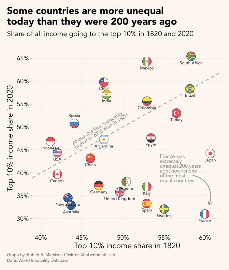
France was extremely unequal 200 years ago; now it’s one of the most equal countries
Source: https://twitter.com/xruiztru/status/1687702683250003969
Diagram is not intuitive, also highly misleading: Do it again with 1970 and 2020, or do a graph over time per country. Because social equality was MUCH better in between & the differences to today’s inequality would stand out much more.
Bah, ça pourrait être mieux, mais y a pire
Si la France est un pays égalitaire (ce que ne dit pas ce truc, c’est juste comparatif), ça doit être tellement irrespirable ailleurs putain.
Anyone verified the data, could explain where it icomes from? Seems very dubious… How anything from 1820 can be measured accurately to start with…? let alone compare to 2020…?
Bonne question effectivement
I’m not sure it’s accurate for all countries, especially outside Europe, but 1820 isn’t prehistory and most European countries already had taxes and well-kept records.
Ça me surprend que le Canada est en dessous de la ligne.
Etonné de voir l’Allemagne aussi haut tiens
Why?
Je ne sais pas, j’ai toujours eu l’impression qu’ils étaient à un niveau équivalent à la France, voir plus bas (donc richesses mieux réparties)
SOMOS EL MEJOR PAID DE CHILE!!! VAMOS MIERDAAAAAAAA!!!

